
A playful, community-focused event campaign built around a unifying visual metaphor. I developed the saltshaker concept to anchor event branding across menus, signage, and digital touchpoints—bringing cohesion and personality to a multi-vendor experience.
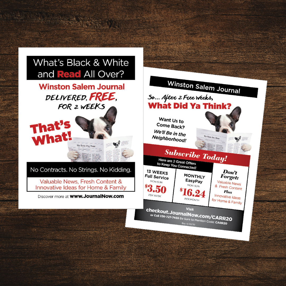
This direct mail flyer reimagines a classic riddle to promote digital subscriptions for a legacy news brand. I led the concept and design, blending editorial wit with bold typography to drive engagement and reinforce brand identity.

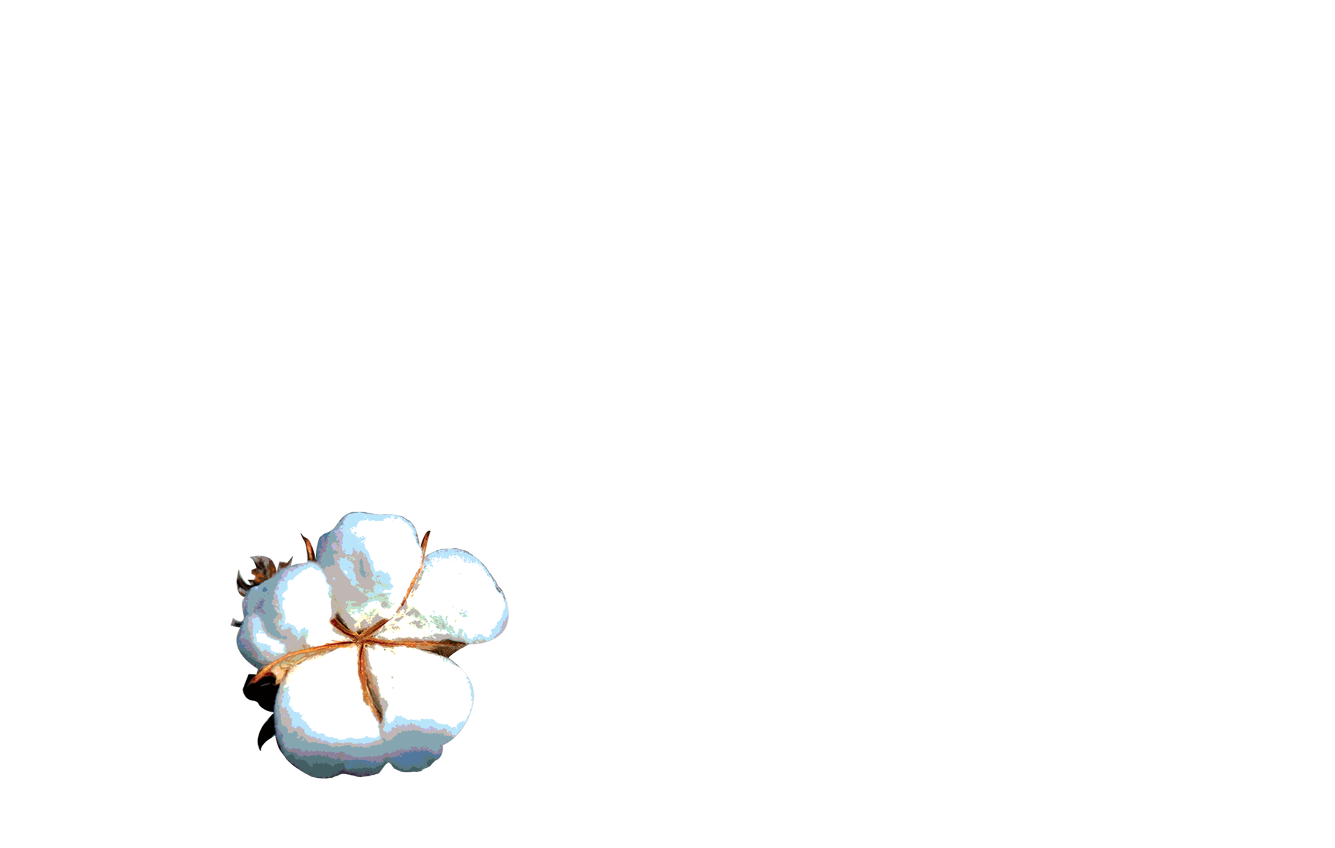
An experimental holiday piece created using AI-generated imagery, then refined and deployed as part of a seasonal campaign. This project reflects a curiosity-driven approach to emerging tools and my commitment to emotionally resonant design.

This large-format installation celebrated a cultural partnership between the Oklahoma Contemporary Museum of Art, Marfa Contemporary in Texas, and Turner Contemporary in Margate, England. The design featured vinyl lettering, layered textures, and large cut-out shapes inspired by each region’s geographic landmarks, transforming the space into a visual dialogue about place, collaboration, and creative exchange.
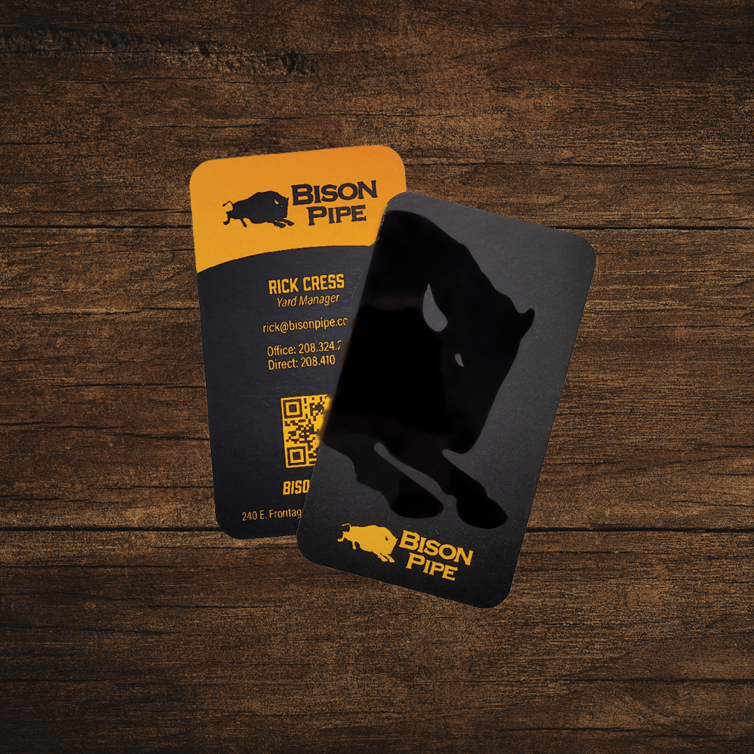
A small-format identity piece designed to align with the broader Bison Pipe brand system. The front features a raised UV coating to accentuate the bison icon—adding texture, emphasis, and a memorable tactile experience that reinforces brand strength.

Product-focused brochures created to distill technical information into branded, digestible formats. These pieces reflect my ability to support B2B sales through clean layout, hierarchy, and tone.